Carolina Medrado
Menu

TP Web
Achieving an 84% boost in monthly revenue through UX reconstruction
Currently being developed
October 2023
TotalPass connects employees in Brazil and Mexico to gyms, studios, and mental well-being solutions, promoting holistic wellness.
Customer acquisition relied on manual direct sales, and TP Web, a digital sales channel, was an abandoned landing page with minimal impact.
The project aimed to turn it into a high-performing sales channel, boosting conversion and revenue without expanding the team.
Challenges
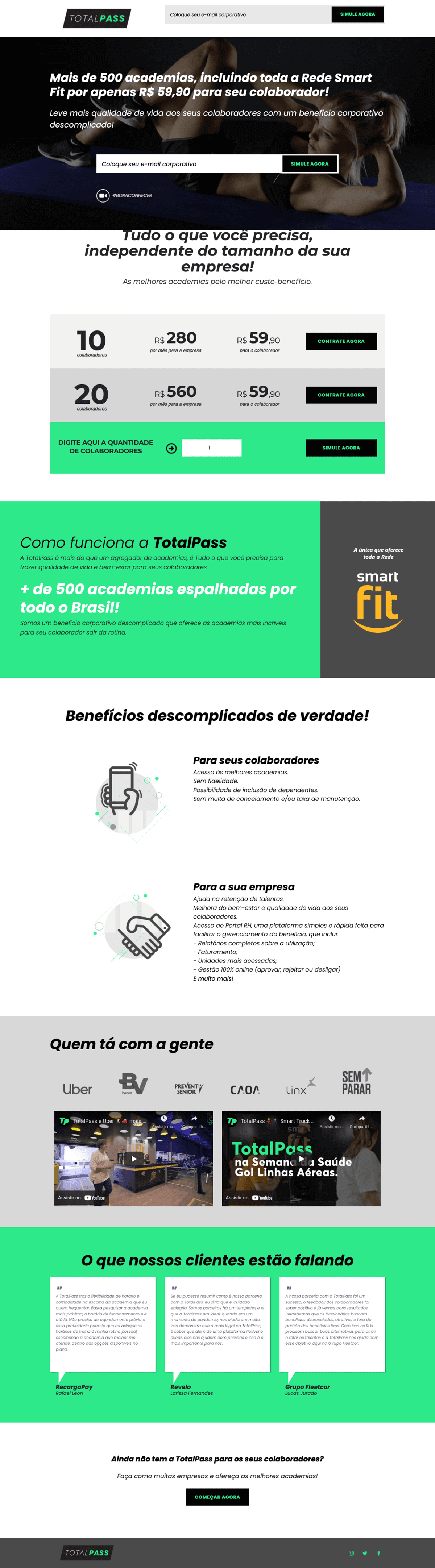
With a small team and a tight deadline, we needed a simple, low-complexity solution. As the only product designer, working with a product manager and one front-end developer, we had to be strategic—no animations, no motion, just a static landing page with a big goal: making TP Web the main acquisition channel.
The old page had major issues. Many small businesses thought TotalPass was only for large companies. Most leads still had questions about the benefit, pricing, and how to sign up. On top of that, the design didn’t inspire trust. Since TotalPass is a well-known brand in Brazil, fraudulent websites often try to impersonate it, making credibility even more important.
Design Solution
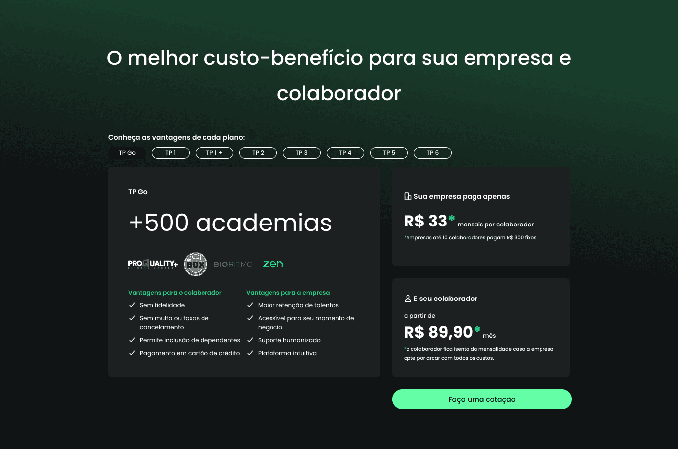
To make TP Web a successful sales channel, we redesigned the experience with a focus on clarity and conversion. Many leads dropped off because they still had questions after reading the page. Important information was hard to find, while less relevant content took up space.
The text-heavy design also didn’t match the company’s visual identity, making users skeptical. We simplified the layout, highlighted key details, and created a more intuitive and trustworthy experience.

Through user interviews and journey mapping, we identified what information was essential, nice to have, or unnecessary at each stage of the buying process.
We also did an extensive benchmark with other corporate benefit quotation landing pages to understand structure and what was on the market in terms of UX.
We refined the copy to answer key questions more clearly and reorganized the page to highlight social proof and the product’s value. Throughout the process, we worked closely with marketing and sales to stay aligned.
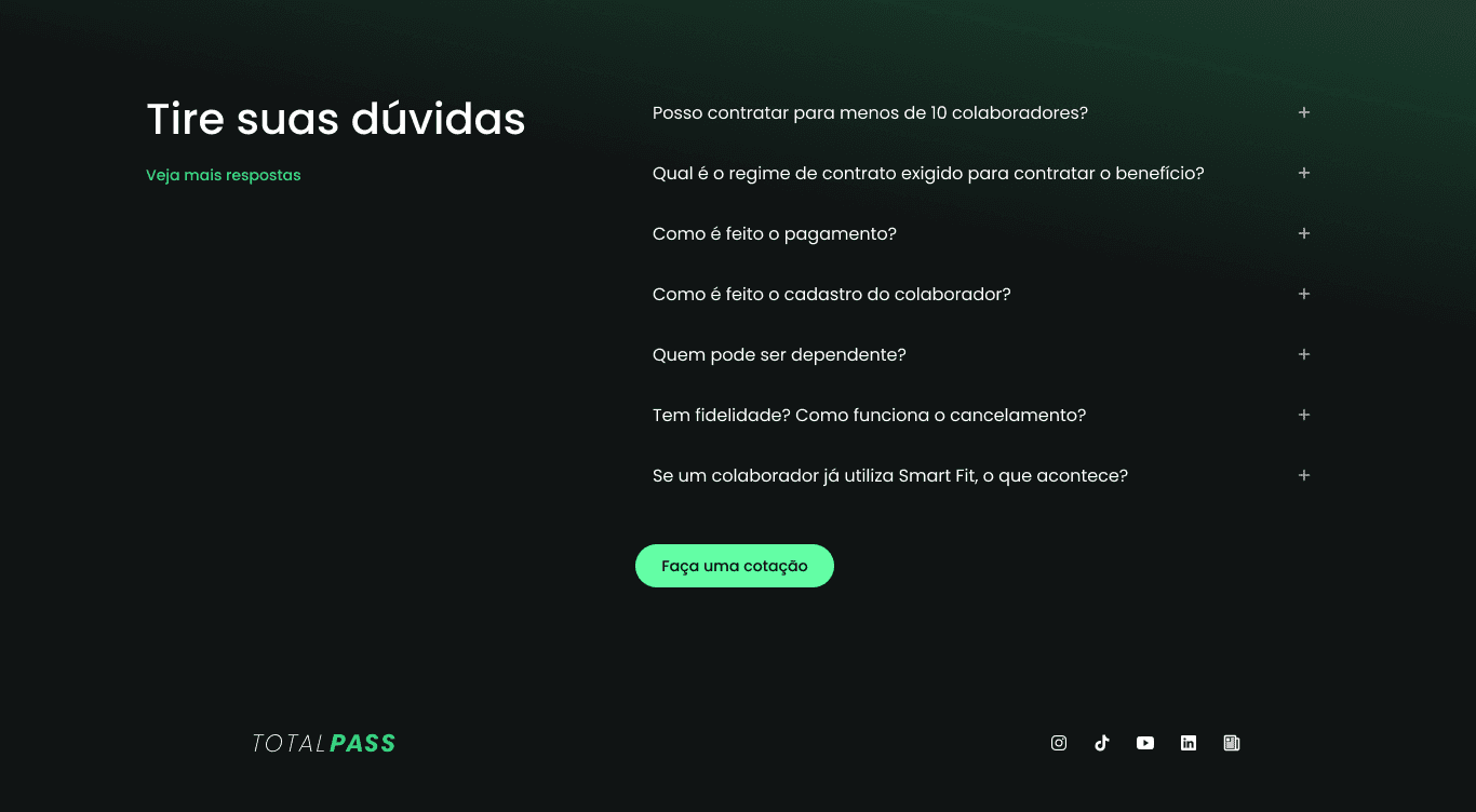
We also redesigned the FAQ page, removing irrelevant questions and adding the most common ones based on user interviews. This made the information more strategic, clear, and useful for leads at that stage of the funnel.
Two layers: core experience, then self-service
Layer 1 — Navigation, filtering, and the new statement
The first focus was making receivables easier to reach and making the statement genuinely useful on mobile.
Improved discoverability: Restructured entry point to surface receivables more clearly within existing navigation — less depth, same mental model.
Rich filtering on mobile: Full filter system covering payment method, sales solution, installment type, card brand, establishment, receiving account, transaction ID, and transaction type — with progressive disclosure to manage complexity.
Multiple statement views: Users switch between detailed, consolidated, and receivables unit (UR) views — matching the right level of detail to the task at hand.
Richer transaction detail: Structured detail screen with tabs: summary, identification, transaction details, transaction lifecycle, and online sale details.
Design system rollout: The entire section rebuilt on the new DS — visually and structurally aligned with the rest of the app.
Layer 2 — Self-service, anticipations, and business overview
The second focus was reducing operational dependency and creating a more strategic view for less experienced business owners.
In-app report export: Users generate and receive filtered reports by email — without any support contact. Custom filters, older periods, and large date ranges all supported.
In-app dispute flow: Users initiate disputes directly in the app — a task that previously required calling or messaging support entirely.
Anticipations subsection: Dedicated area for receivables negotiations, organized by type (internal, external, XPTO) — easy to track and understand.
Business overview dashboard: Simplified management view for less financially experienced users — key indicators in plain language, no financial literacy required.
Outcomes
In less than two sprints, we delivered a new landing page that felt more trustworthy, professional, and aligned with TotalPass’s branding. Key information was placed front and center, the mobile experience was optimized for better loading and readability, and the quotation process was streamlined for a faster, smoother experience.
In under three months, TP Web grew to represent 84% of TotalPass’s monthly corporate sales.
Read next
Question about my work?
Carolina Medrado
Menu
TP Web
Achieving an 84% boost in monthly revenue through UX reconstruction
Currently being developed
October 2023
TotalPass connects employees in Brazil and Mexico to gyms, studios, and mental well-being solutions, promoting holistic wellness.
Customer acquisition relied on manual direct sales, and TP Web, a digital sales channel, was an abandoned landing page with minimal impact.
The project aimed to turn it into a high-performing sales channel, boosting conversion and revenue without expanding the team.
Challenges
With a small team and a tight deadline, we needed a simple, low-complexity solution. As the only product designer, working with a product manager and one front-end developer, we had to be strategic—no animations, no motion, just a static landing page with a big goal: making TP Web the main acquisition channel.
The old page had major issues. Many small businesses thought TotalPass was only for large companies. Most leads still had questions about the benefit, pricing, and how to sign up. On top of that, the design didn’t inspire trust. Since TotalPass is a well-known brand in Brazil, fraudulent websites often try to impersonate it, making credibility even more important.
Design Solution
To make TP Web a successful sales channel, we redesigned the experience with a focus on clarity and conversion. Many leads dropped off because they still had questions after reading the page. Important information was hard to find, while less relevant content took up space.
The text-heavy design also didn’t match the company’s visual identity, making users skeptical. We simplified the layout, highlighted key details, and created a more intuitive and trustworthy experience.
Through user interviews and journey mapping, we identified what information was essential, nice to have, or unnecessary at each stage of the buying process.
We also did an extensive benchmark with other corporate benefit quotation landing pages to understand structure and what was on the market in terms of UX.
We refined the copy to answer key questions more clearly and reorganized the page to highlight social proof and the product’s value. Throughout the process, we worked closely with marketing and sales to stay aligned.
We also redesigned the FAQ page, removing irrelevant questions and adding the most common ones based on user interviews. This made the information more strategic, clear, and useful for leads at that stage of the funnel.
Two layers: core experience, then self-service
Layer 1 — Navigation, filtering, and the new statement
The first focus was making receivables easier to reach and making the statement genuinely useful on mobile.
Improved discoverability: Restructured entry point to surface receivables more clearly within existing navigation — less depth, same mental model.
Rich filtering on mobile: Full filter system covering payment method, sales solution, installment type, card brand, establishment, receiving account, transaction ID, and transaction type — with progressive disclosure to manage complexity.
Multiple statement views: Users switch between detailed, consolidated, and receivables unit (UR) views — matching the right level of detail to the task at hand.
Richer transaction detail: Structured detail screen with tabs: summary, identification, transaction details, transaction lifecycle, and online sale details.
Design system rollout: The entire section rebuilt on the new DS — visually and structurally aligned with the rest of the app.
Layer 2 — Self-service, anticipations, and business overview
The second focus was reducing operational dependency and creating a more strategic view for less experienced business owners.
In-app report export: Users generate and receive filtered reports by email — without any support contact. Custom filters, older periods, and large date ranges all supported.
In-app dispute flow: Users initiate disputes directly in the app — a task that previously required calling or messaging support entirely.
Anticipations subsection: Dedicated area for receivables negotiations, organized by type (internal, external, XPTO) — easy to track and understand.
Business overview dashboard: Simplified management view for less financially experienced users — key indicators in plain language, no financial literacy required.
Outcomes
In less than two sprints, we delivered a new landing page that felt more trustworthy, professional, and aligned with TotalPass’s branding. Key information was placed front and center, the mobile experience was optimized for better loading and readability, and the quotation process was streamlined for a faster, smoother experience.
In under three months, TP Web grew to represent 84% of TotalPass’s monthly corporate sales.
Read next
Question about my work?
Carolina Medrado
Menu
TP Web
Achieving an 84% boost in monthly revenue through UX reconstruction
Currently being developed
October 2023
TotalPass connects employees in Brazil and Mexico to gyms, studios, and mental well-being solutions, promoting holistic wellness.
Customer acquisition relied on manual direct sales, and TP Web, a digital sales channel, was an abandoned landing page with minimal impact.
The project aimed to turn it into a high-performing sales channel, boosting conversion and revenue without expanding the team.
Challenges
With a small team and a tight deadline, we needed a simple, low-complexity solution. As the only product designer, working with a product manager and one front-end developer, we had to be strategic—no animations, no motion, just a static landing page with a big goal: making TP Web the main acquisition channel.
The old page had major issues. Many small businesses thought TotalPass was only for large companies. Most leads still had questions about the benefit, pricing, and how to sign up. On top of that, the design didn’t inspire trust. Since TotalPass is a well-known brand in Brazil, fraudulent websites often try to impersonate it, making credibility even more important.
Design Solution
To make TP Web a successful sales channel, we redesigned the experience with a focus on clarity and conversion. Many leads dropped off because they still had questions after reading the page. Important information was hard to find, while less relevant content took up space.
The text-heavy design also didn’t match the company’s visual identity, making users skeptical. We simplified the layout, highlighted key details, and created a more intuitive and trustworthy experience.
Through user interviews and journey mapping, we identified what information was essential, nice to have, or unnecessary at each stage of the buying process.
We also did an extensive benchmark with other corporate benefit quotation landing pages to understand structure and what was on the market in terms of UX.
We refined the copy to answer key questions more clearly and reorganized the page to highlight social proof and the product’s value. Throughout the process, we worked closely with marketing and sales to stay aligned.
We also redesigned the FAQ page, removing irrelevant questions and adding the most common ones based on user interviews. This made the information more strategic, clear, and useful for leads at that stage of the funnel.
Two layers: core experience, then self-service
Layer 1 — Navigation, filtering, and the new statement
The first focus was making receivables easier to reach and making the statement genuinely useful on mobile.
Improved discoverability: Restructured entry point to surface receivables more clearly within existing navigation — less depth, same mental model.
Rich filtering on mobile: Full filter system covering payment method, sales solution, installment type, card brand, establishment, receiving account, transaction ID, and transaction type — with progressive disclosure to manage complexity.
Multiple statement views: Users switch between detailed, consolidated, and receivables unit (UR) views — matching the right level of detail to the task at hand.
Richer transaction detail: Structured detail screen with tabs: summary, identification, transaction details, transaction lifecycle, and online sale details.
Design system rollout: The entire section rebuilt on the new DS — visually and structurally aligned with the rest of the app.
Layer 2 — Self-service, anticipations, and business overview
The second focus was reducing operational dependency and creating a more strategic view for less experienced business owners.
In-app report export: Users generate and receive filtered reports by email — without any support contact. Custom filters, older periods, and large date ranges all supported.
In-app dispute flow: Users initiate disputes directly in the app — a task that previously required calling or messaging support entirely.
Anticipations subsection: Dedicated area for receivables negotiations, organized by type (internal, external, XPTO) — easy to track and understand.
Business overview dashboard: Simplified management view for less financially experienced users — key indicators in plain language, no financial literacy required.
Outcomes
In less than two sprints, we delivered a new landing page that felt more trustworthy, professional, and aligned with TotalPass’s branding. Key information was placed front and center, the mobile experience was optimized for better loading and readability, and the quotation process was streamlined for a faster, smoother experience.
In under three months, TP Web grew to represent 84% of TotalPass’s monthly corporate sales.