Carolina Medrado
Menu

PicPay
From a buried, limited feature to a self-service financial hub, giving Brazil's small business owners real control over their money.
Currently being developed
June 2026 (expected)
A 64-million-user bank whose B2B feature couldn't keep up
PicPay is Brazil's 2nd largest digital bank — 64 million accounts, 42 million active users, with over 32% relying on it as their primary bank. PicPay PJ is the business banking arm: built for entrepreneurs and small businesses.
The segment is one of PicPay's fastest-growing bets. In Q2 2025, PJ acquiring volume hit R$14 billion — up 52% year-on-year. The core user isn't a CFO with a finance team. It's a solo entrepreneur managing everything from their phone, often without a separate accounting tool.
The receivables section — covering transactions, settlements, anticipations, and disputes — was one of the most critical areas of the app. It was also one of the most broken.
Sole designer, full ownership
I led the problem framing, research synthesis, information architecture, interaction design, prototyping, and design system rollout. I worked as a direct partner to the product manager.
Support ticket analysis, sales team feedback, App Store reviews, NPS data, and user interviews conducted by the company's UX researcher, synthesized and framed by me.
Challenges
Five ways a critical feature was failing its users
Discovery surfaced a consistent theme: simple financial tasks that should be self-service all required contacting support. This drove operational costs up and user confidence down. Five specific problems fueled this:
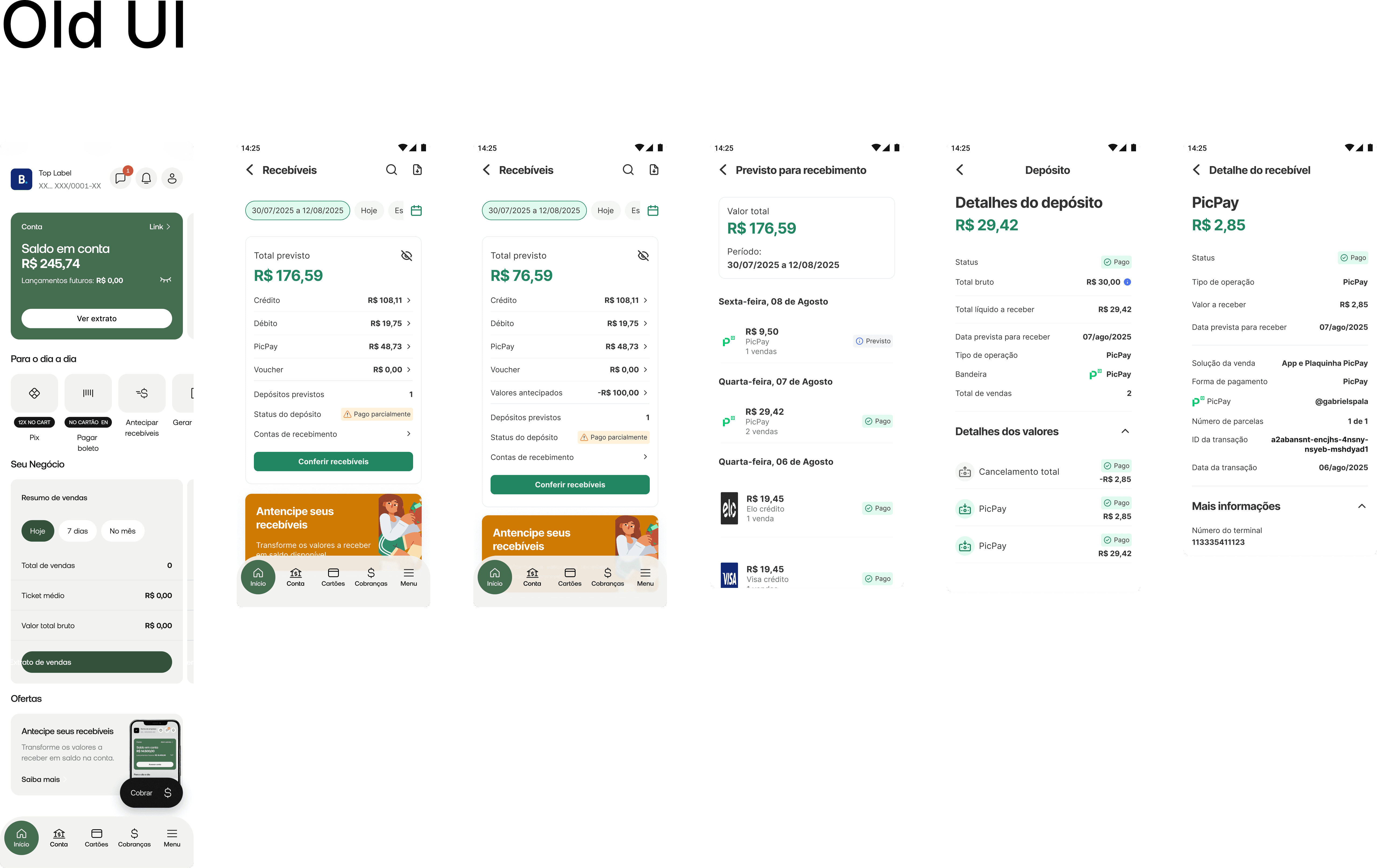
Hidden entry point: The receivables menu was buried inside an already information-dense app. Everyday users couldn't find the feature they needed most.
No design system alignment: The section was visually inconsistent with the rest of the app — outdated components, misaligned UI, creating a disjointed experience that eroded trust.
Filtering locked to web-only: Advanced filters existed only in the web panel, designed for large clients. The core user (a small business owner on mobile) had almost no filtering capability.
No self-service exports: Generating a custom report required contacting human support. Every single request had an operational cost; for the user and the company.
Confusing transaction data: Information in the statement was hard to parse, making monthly bank reconciliation (essential for any business) unnecessarily difficult and error-prone.
Core insight: The product was treating its most valuable growing segment; the mobile-first solo entrepreneur — like a back-office user at a desktop. Every pain point pointed to the same root cause: the feature was built for the wrong context.
Design Solution
The decisions that shaped the solution
On the filter system: power vs. overwhelm
The biggest tension in the filter redesign was between richness and cognitive load. Early on, the question was whether to introduce a simplified filter system (2–3 options, low friction) or a full-featured one that matched what web users already had.
Considered & rejected
Simplified filters only — limit mobile to date + payment method to avoid overwhelming less-experienced users. Cleaner UI, lower learning curve.
Why rejected: Support ticket analysis showed users weren't overwhelmed by options — they were frustrated by their absence. The real request was "let me filter by card brand / establishment / transaction type," not "make this simpler." Oversimplifying would have solved the wrong problem.
Chosen direction
Progressive disclosure, surface the most-used filters immediately, with a full filter panel accessible one tap deeper. Power users get full control; casual users aren't confronted with complexity upfront.
On the export flow: async delivery vs. in-app download
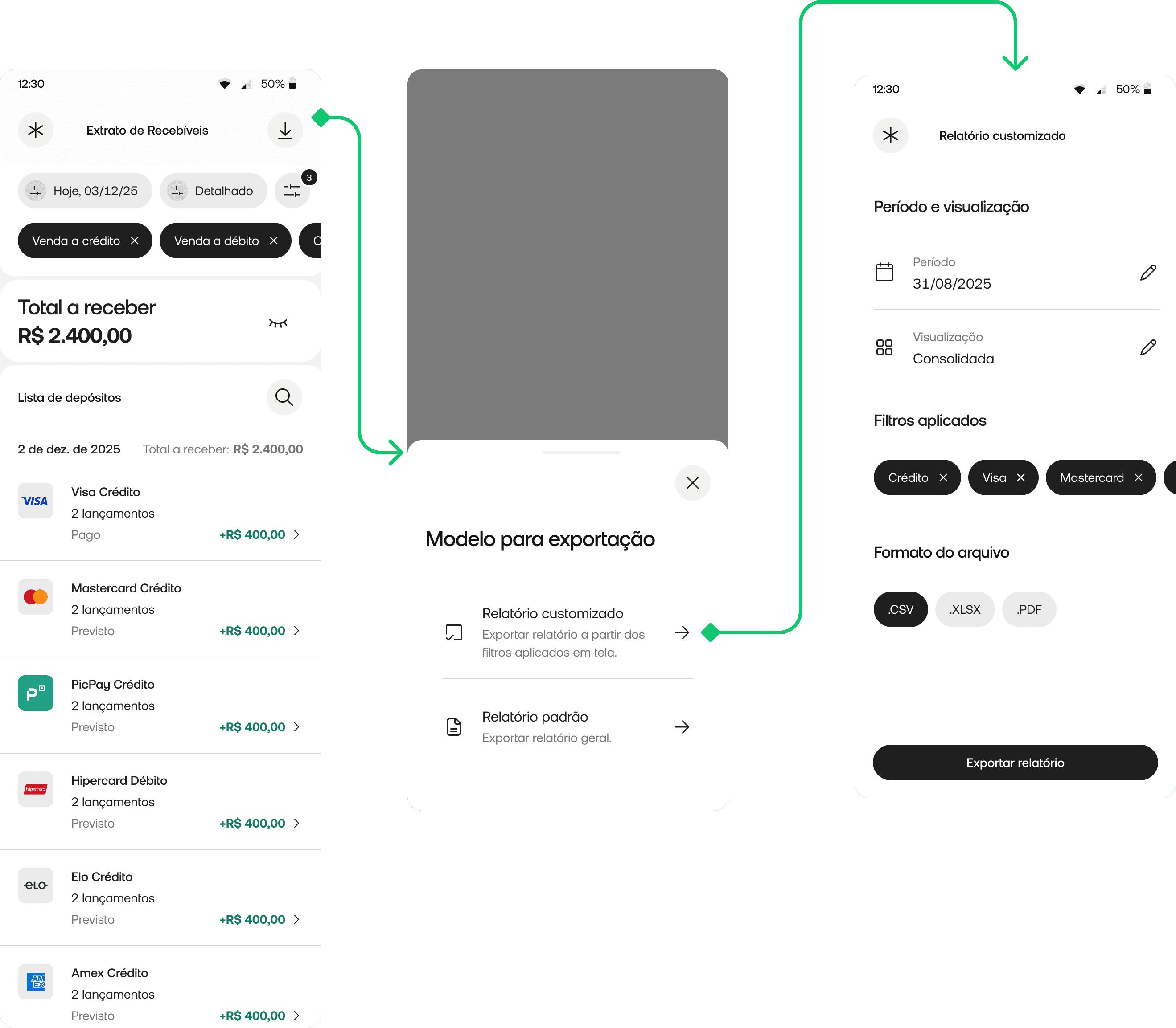
For report exports, two architectures were possible: an in-app download (synchronous, instant) or an email delivery flow (async). Given the nature of the data, potentially large date ranges, custom filters — we chose async email delivery. This meant designing for a new user expectation: the report isn't here yet, but it's coming. The design had to handle the intermediate state clearly, without leaving users uncertain about whether their request went through.
On navigation restructuring
Rather than creating a new top-level section, we improved discoverability by surfacing receivables within the existing navigation hierarchy, reducing the entry point depth without breaking the overall structure users already knew. A full navigation overhaul would have been higher-risk and outside the project scope.

Edge Cases & Real-World Complexity
Multi-establishment accounts
Many PJ users operate more than one business unit under the same account. The filter system needed to handle establishment-level filtering without conflating data — a detail that required close alignment with backend data structure.
Empty states after filtering
When a user applies filters and gets zero results, the experience needed to distinguish between "no data exists" and "your filter combination returned nothing" — with clear paths to adjust filters or expand the date range.
Export request feedback
Since export delivery is async via email, the design needed to clearly communicate: request received → processing → sent to email. Without this, users would resubmit the same request multiple times — creating duplicate reports and operational noise.
Dispute initiation in ambiguous states
Not all transactions are disputable. The dispute flow had to handle eligibility logic gracefully — surfacing a clear explanation when a transaction couldn't be disputed rather than hiding the option or showing a cryptic error.
Two layers: core experience, then self-service
Layer 1 — Navigation, filtering, and the new statement
The first focus was making receivables easier to reach and making the statement genuinely useful on mobile.
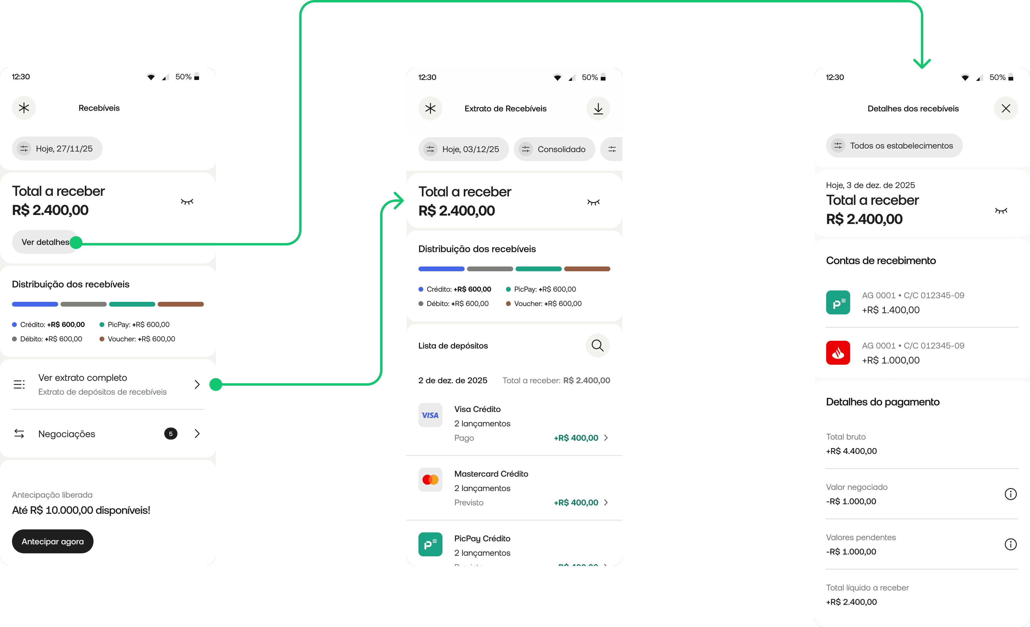
Improved discoverability: Restructured entry point to surface receivables more clearly within existing navigation — less depth, same mental model.
Rich filtering on mobile: Full filter system covering payment method, sales solution, installment type, card brand, establishment, receiving account, transaction ID, and transaction type — with progressive disclosure to manage complexity.
Multiple statement views: Users switch between detailed, consolidated, and receivables unit (UR) views — matching the right level of detail to the task at hand.
Richer transaction detail: Structured detail screen with tabs: summary, identification, transaction details, transaction lifecycle, and online sale details.
Design system rollout: The entire section rebuilt on the new DS — visually and structurally aligned with the rest of the app.
Layer 2 — Self-service, anticipations, and business overview
The second focus was reducing operational dependency and creating a more strategic view for less experienced business owners.
In-app report export: Users generate and receive filtered reports by email — without any support contact. Custom filters, older periods, and large date ranges all supported.
In-app dispute flow: Users initiate disputes directly in the app — a task that previously required calling or messaging support entirely.
Anticipations subsection: Dedicated area for receivables negotiations, organized by type (internal, external, XPTO) — easy to track and understand.
Business overview dashboard: Simplified management view for less financially experienced users — key indicators in plain language, no financial literacy required.
Outcomes
The stakes — and what comes next
The project is currently in development, with full specs, prototypes, and handoff complete. Since it hasn't shipped yet, I'm intentional about not stating outcomes as facts — but the expected impact is grounded in the problems we validated:
Support contact reduction for tasks that should never have required human intervention: custom report requests, transaction clarifications, dispute initiation. Every one of these is now self-service.
Faster reconciliation for the business owners who use the statement to close their books each month. The new filtering and structured transaction detail directly address the "confusing data" problem identified in discovery.
More broadly, this repositions PicPay PJ's receivables experience to match the ambition of the product: a financial hub that works for the entrepreneur on the go, not just the back-office user at a desk.
What I'd do differently
I'd validate the filter architecture with lower fidelity before building the full system. We made a reasoned bet on progressive disclosure based on support ticket analysis — but I didn't test the filter panel structure with actual users before the design was finalized. A quick unmoderated test with 5 users on a prototype would have de-risked the information architecture earlier and cheaper.
I'd involve the operations team earlier in the dispute flow design. The dispute flow had eligibility logic that I only fully understood mid-design, after conversations with ops. That created some rework on the edge case states. Getting ops in the room during problem framing — not just during QA — would have saved time and produced a more robust first proposal.
I'd push harder for a phased release with metrics tracking from day one. Because the feature is shipping as a complete redesign rather than incrementally, we won't have a clean baseline comparison. If I could revisit the roadmap conversation, I'd advocate for releasing one layer at a time — starting with the filter system — so we could measure impact at each step and build a stronger feedback loop.
Read next
Question about my work?
Carolina Medrado
Menu
PicPay
From a buried, limited feature to a self-service financial hub, giving Brazil's small business owners real control over their money.
Currently being developed
June 2026 (expected)
A 64-million-user bank whose B2B feature couldn't keep up
PicPay is Brazil's 2nd largest digital bank — 64 million accounts, 42 million active users, with over 32% relying on it as their primary bank. PicPay PJ is the business banking arm: built for entrepreneurs and small businesses.
The segment is one of PicPay's fastest-growing bets. In Q2 2025, PJ acquiring volume hit R$14 billion — up 52% year-on-year. The core user isn't a CFO with a finance team. It's a solo entrepreneur managing everything from their phone, often without a separate accounting tool.
The receivables section — covering transactions, settlements, anticipations, and disputes — was one of the most critical areas of the app. It was also one of the most broken.
Sole designer, full ownership
I led the problem framing, research synthesis, information architecture, interaction design, prototyping, and design system rollout. I worked as a direct partner to the product manager.
Support ticket analysis, sales team feedback, App Store reviews, NPS data, and user interviews conducted by the company's UX researcher, synthesized and framed by me.
Challenges
Five ways a critical feature was failing its users
Discovery surfaced a consistent theme: simple financial tasks that should be self-service all required contacting support. This drove operational costs up and user confidence down. Five specific problems fueled this:
Hidden entry point: The receivables menu was buried inside an already information-dense app. Everyday users couldn't find the feature they needed most.
No design system alignment: The section was visually inconsistent with the rest of the app — outdated components, misaligned UI, creating a disjointed experience that eroded trust.
Filtering locked to web-only: Advanced filters existed only in the web panel, designed for large clients. The core user (a small business owner on mobile) had almost no filtering capability.
No self-service exports: Generating a custom report required contacting human support. Every single request had an operational cost; for the user and the company.
Confusing transaction data: Information in the statement was hard to parse, making monthly bank reconciliation (essential for any business) unnecessarily difficult and error-prone.
Core insight: The product was treating its most valuable growing segment; the mobile-first solo entrepreneur — like a back-office user at a desktop. Every pain point pointed to the same root cause: the feature was built for the wrong context.
Design Solution
The decisions that shaped the solution
On the filter system: power vs. overwhelm
The biggest tension in the filter redesign was between richness and cognitive load. Early on, the question was whether to introduce a simplified filter system (2–3 options, low friction) or a full-featured one that matched what web users already had.
Considered & rejected
Simplified filters only — limit mobile to date + payment method to avoid overwhelming less-experienced users. Cleaner UI, lower learning curve.
Why rejected: Support ticket analysis showed users weren't overwhelmed by options — they were frustrated by their absence. The real request was "let me filter by card brand / establishment / transaction type," not "make this simpler." Oversimplifying would have solved the wrong problem.
Chosen direction
Progressive disclosure, surface the most-used filters immediately, with a full filter panel accessible one tap deeper. Power users get full control; casual users aren't confronted with complexity upfront.
On the export flow: async delivery vs. in-app download
For report exports, two architectures were possible: an in-app download (synchronous, instant) or an email delivery flow (async). Given the nature of the data, potentially large date ranges, custom filters — we chose async email delivery. This meant designing for a new user expectation: the report isn't here yet, but it's coming. The design had to handle the intermediate state clearly, without leaving users uncertain about whether their request went through.
On navigation restructuring
Rather than creating a new top-level section, we improved discoverability by surfacing receivables within the existing navigation hierarchy, reducing the entry point depth without breaking the overall structure users already knew. A full navigation overhaul would have been higher-risk and outside the project scope.
Edge Cases & Real-World Complexity
Multi-establishment accounts
Many PJ users operate more than one business unit under the same account. The filter system needed to handle establishment-level filtering without conflating data — a detail that required close alignment with backend data structure.
Empty states after filtering
When a user applies filters and gets zero results, the experience needed to distinguish between "no data exists" and "your filter combination returned nothing" — with clear paths to adjust filters or expand the date range.
Export request feedback
Since export delivery is async via email, the design needed to clearly communicate: request received → processing → sent to email. Without this, users would resubmit the same request multiple times — creating duplicate reports and operational noise.
Dispute initiation in ambiguous states
Not all transactions are disputable. The dispute flow had to handle eligibility logic gracefully — surfacing a clear explanation when a transaction couldn't be disputed rather than hiding the option or showing a cryptic error.
Two layers: core experience, then self-service
Layer 1 — Navigation, filtering, and the new statement
The first focus was making receivables easier to reach and making the statement genuinely useful on mobile.
Improved discoverability: Restructured entry point to surface receivables more clearly within existing navigation — less depth, same mental model.
Rich filtering on mobile: Full filter system covering payment method, sales solution, installment type, card brand, establishment, receiving account, transaction ID, and transaction type — with progressive disclosure to manage complexity.
Multiple statement views: Users switch between detailed, consolidated, and receivables unit (UR) views — matching the right level of detail to the task at hand.
Richer transaction detail: Structured detail screen with tabs: summary, identification, transaction details, transaction lifecycle, and online sale details.
Design system rollout: The entire section rebuilt on the new DS — visually and structurally aligned with the rest of the app.
Layer 2 — Self-service, anticipations, and business overview
The second focus was reducing operational dependency and creating a more strategic view for less experienced business owners.
In-app report export: Users generate and receive filtered reports by email — without any support contact. Custom filters, older periods, and large date ranges all supported.
In-app dispute flow: Users initiate disputes directly in the app — a task that previously required calling or messaging support entirely.
Anticipations subsection: Dedicated area for receivables negotiations, organized by type (internal, external, XPTO) — easy to track and understand.
Business overview dashboard: Simplified management view for less financially experienced users — key indicators in plain language, no financial literacy required.
Outcomes
The stakes — and what comes next
The project is currently in development, with full specs, prototypes, and handoff complete. Since it hasn't shipped yet, I'm intentional about not stating outcomes as facts — but the expected impact is grounded in the problems we validated:
Support contact reduction for tasks that should never have required human intervention: custom report requests, transaction clarifications, dispute initiation. Every one of these is now self-service.
Faster reconciliation for the business owners who use the statement to close their books each month. The new filtering and structured transaction detail directly address the "confusing data" problem identified in discovery.
More broadly, this repositions PicPay PJ's receivables experience to match the ambition of the product: a financial hub that works for the entrepreneur on the go, not just the back-office user at a desk.
What I'd do differently
I'd validate the filter architecture with lower fidelity before building the full system. We made a reasoned bet on progressive disclosure based on support ticket analysis — but I didn't test the filter panel structure with actual users before the design was finalized. A quick unmoderated test with 5 users on a prototype would have de-risked the information architecture earlier and cheaper.
I'd involve the operations team earlier in the dispute flow design. The dispute flow had eligibility logic that I only fully understood mid-design, after conversations with ops. That created some rework on the edge case states. Getting ops in the room during problem framing — not just during QA — would have saved time and produced a more robust first proposal.
I'd push harder for a phased release with metrics tracking from day one. Because the feature is shipping as a complete redesign rather than incrementally, we won't have a clean baseline comparison. If I could revisit the roadmap conversation, I'd advocate for releasing one layer at a time — starting with the filter system — so we could measure impact at each step and build a stronger feedback loop.